Simply Expressing the Meaning Behind the Company Name
Simple Design That Embodies Japanese Culture
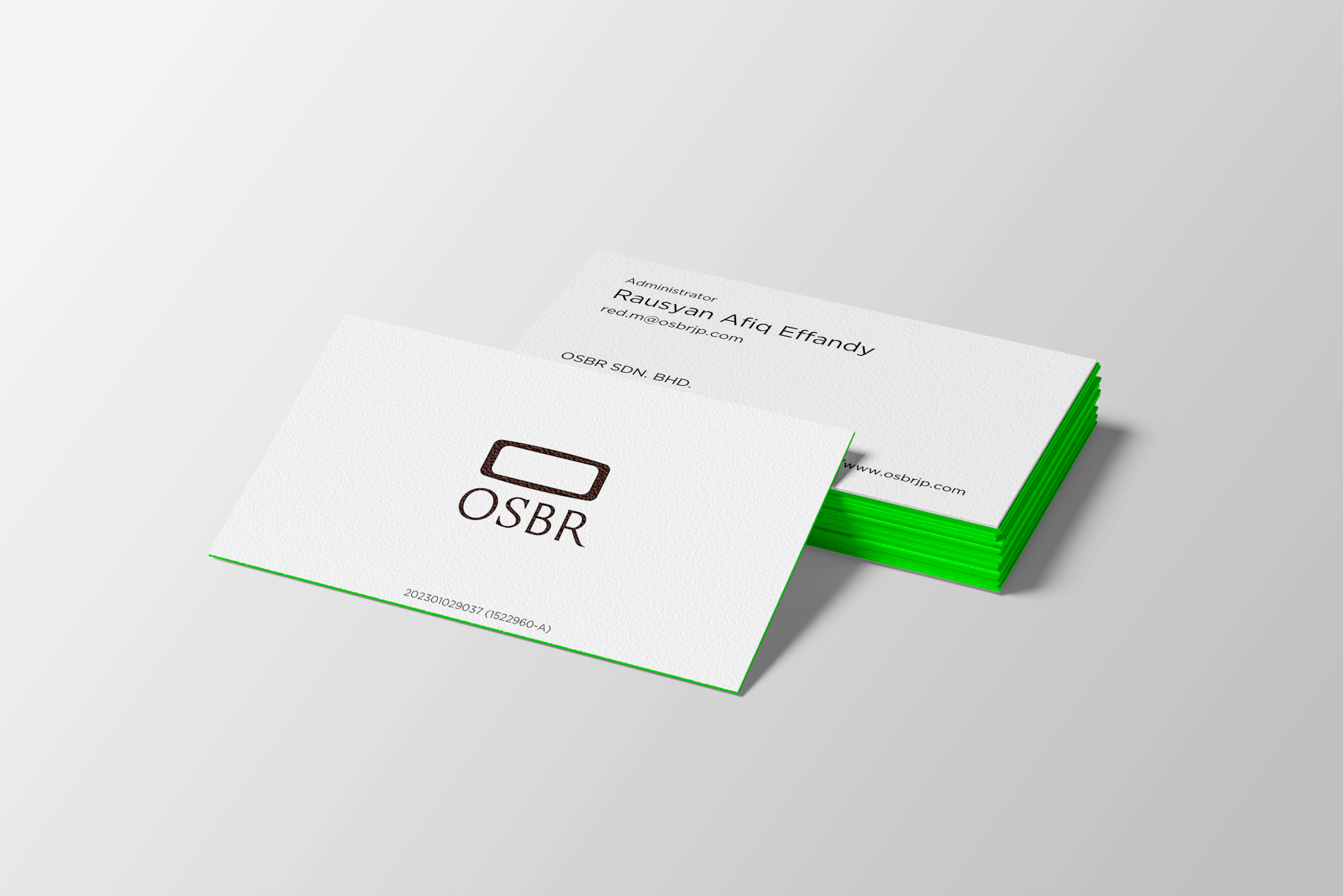
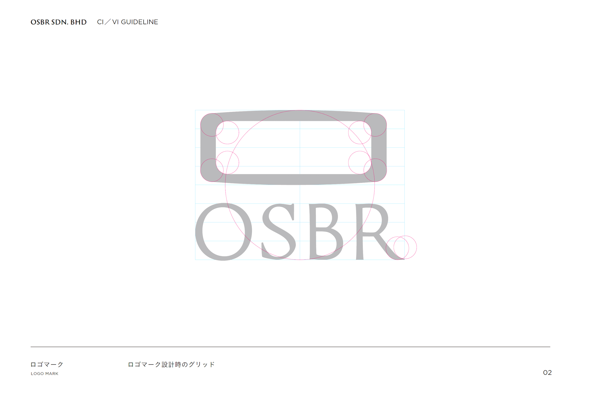
OSBR is an IT venture company established to offer B2C oshibori (wet towel) sales services in Southeast Asia using SNS and web marketing. The company name, “OSBR,” is derived from the sound of the word “oshibori.” The symbol mark combines the letter “O,” the first letter of OSBR, with a top-down view of an oshibori placed on a tray. The oshibori is a cultural icon that represents Japan’s unique values of omotenashi (hospitality), respect, and cleanliness. This symbol embodies the values Japan has long cherished: courtesy and integrity.

Balancing Reliability with Both Cooperativeness and Universality
The OSBR symbol mark was designed to be simple while conveying a sense of comfort and trust. Just like the careful consideration shown when handing someone an oshibori, we wanted the mark to give viewers a feeling of pleasantness and a commitment to quality. We hope this logo will play an important role in communicating OSBR’s philosophy and values to the world. To reflect OSBR’s role in collaborating with various companies and brands to create new value, the design emphasizes visibility across all media and harmony with other elements. Rather than being overly assertive, we pursued simplicity to quietly but surely convey OSBR’s sincerity and reliability. The goal was to create a timeless design that will be loved for years to come.
(Category)
Planning (Concept & Promotion)(23)
Branding(10)
Brand Site(4)
Service Design(3)
Corporate Site(13)
Recruitment Site(7)
Landing Page(17)
EC Site(6)
Animation(11)
CI & VI Logo Design(14)
Graphic Design(36)
Editorial Design(11)
Outdoor & Transit Advertising(1)
Copywriting(25)
Illustration(6)
Video Production(5)
AI-Powered Development(1)
AWS Infrastructure & System Development(4)
3DCG(1)
SNS(1)
(Pick up)


Scroll to Next